Data Visualization: How Best To Do It

Big Data Analytics has made understanding data easier than ever before. The amount of data generated now is ten folds than that a few years ago. In fact, it is much more than ten folds. Drawing inferences and insights into patterns related to a business are both efficient and effective, thanks to Big Data Analytics. While it is exciting to know the minute details that good data can provide, it is also taxing to understand how best to present it. This is exactly what Data Visualization deals with.
Data Visualization is a term used for all methods which help present data in an easy-to-understand and visually appealing manner. The representation of data can be in the form of charts, including and beyond the generic Excel-based charts and graphs. Data Visualization software allows you to present data that might go unnoticed in the text. Significant correlations or patterns hit the eye and minds of the people seeing data in the form of a chart faster than text. The latest software in Data Visualization helps present data in formats like infographics, geographic maps, detailed charts, dials, and gauges. All these formats help drive a point home in the shortest time!
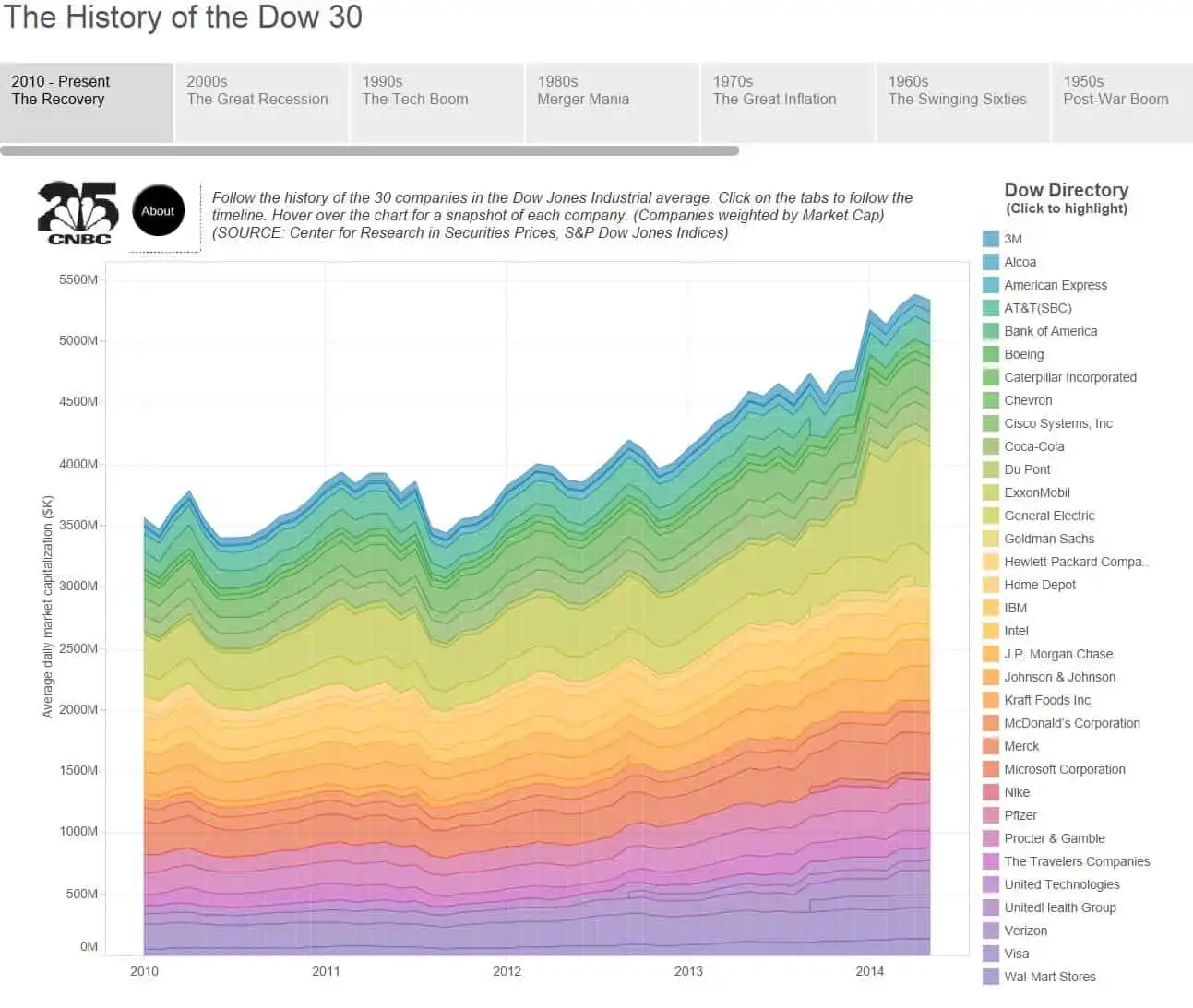
Take, for instance, the following chart: One look at it and you know how 30 companies have performed since the 1950s till date. That’s a lot of time and a lot of data. All are presented in one chart that is not taxing to the eye. It is also visually delightful. It helps understand the various milestone events that happened since the 1950s. Impressive, isn’t it!? Wait, there is more to floor you (Here's the perfect parcel of information to learn data science).

Img Source: www.tableau.com
If you go to the original chart made by Tableau Software, you can actually hover on the chart and see more details. It is a mountain load of important information about these 30 companies, all packed and presented in one chart. Commendable! Imagine presenting this wealth of information in the text. It is going to be one tome of a book! In this sense, Data Visualization is an art form!
Attention to the following rudimentary elements will help you in your journey of perfecting Data Visualization. These elements are the essence of good Data Visualization practices by the best in the industry.
Keep it Simple
This is probably the most important yet the most ignored element in Data Visualization. It is not necessary to have a complicated-looking chart to prove a point. Simple charts can do the same thing too. In fact, they drop all the unnecessary angles which distract you from the important points a chart is presenting. You are making a chart to say something. If your end user is confused because your chart is complicated, then it’s a lost cause. As a case in point, if a simple unicolor two-dimensional chart can do the job for you, there is no need to create a 3D multi-color chart.
Use Colors to Convey
Yes, a chart gives you the freedom to present data colorfully. No, there is no need to splash a multitude of colors in one chart. Unless, of course, the chart so demands it, like the 30 Companies chart we discussed a while ago!
Many people seem to think that a colorful chart is important. On the contrary, just the right amount of color is good enough. It is also important to understand what colors to use. Every color has an intuitive meaning that we all associate with. For instance, Red means danger. It means the same across the globe.
Another important aspect of colors is using the right combinations. Glaring combinations put your viewers off! Default choices might not always work best for you. Feel free to use your own combinations of colors with utmost importance to the viewer. Colors, if they do not help convey the point, are a nuisance! Here’s a really good blog post on the usage of colors. The whole post is great and points no. 3 discusses colors in detail with relevant images.
Maintain Data Accuracy
Numbers don’t lie! It is the same case with all data. All data depicting graphs and charts should do the same too. They must maintain data accuracy at all costs. After all, what good is a chart if there is no truth in it?
Data accuracy is like the soul of a chart. It shouldn’t be tampered with. A graph released by Reuters on Gun Deaths in Florida is a good example to know what not to do with respect to data accuracy (also consider checking out this career guide for data science jobs).
Attention Retention
Like the case with all things technology, attention retention is an important aspect of graphs. Any visual that doesn’t convey the core of its message within 5 seconds is a wasted effort. Graphs or charts created using good quality data visualization software help in retaining the essence of the data and presenting it in a less than 5-sec format. But, relying completely on software is not a great idea. You, as the creator of a particular chart, should be clear about the main idea that you want to convey.
Just like language has rules about grammar, vocabulary, and spelling, the design has rules too. Sticking to these rules helps! It makes your data.
Start your Data Visualization journey with OdinSchool today!