Elevating Your Power BI Visualizations: Beyond the Basics

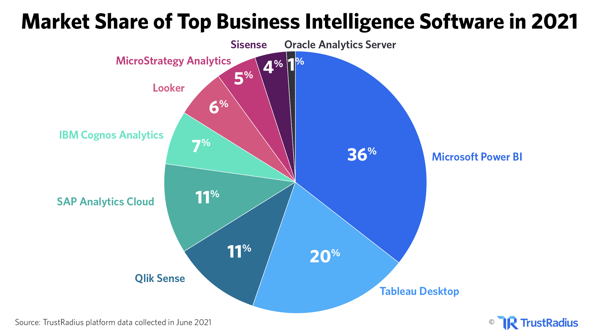
Gartner's Magic Quadrant data shows Microsoft (Power BI) as the leader. source
With a 36.53% market share, Power BI is the most popular data analytics platform among businesses. source

Power of Power BI Visualization
Data visualization turns complex data into easy-to-understand visuals like charts and graphs. This helps us quickly see trends and patterns, and make smart decisions based on data.
Power BI is a tool that's great for this, making it simpler to turn numbers into stories through engaging visuals.
There was a time when I wondered, 'How can I build a career solely by mastering visualization? Surely, coding skills are a must and I was so wrong!' - Kirti Gupta, Business Intelligence Developer.
Visualization Role
Visualization plays a pivotal role in exploring and analyzing data. It aids in:
-
Spotting Trends: Visual representations help in quickly identifying upward or downward trends over time. This is essential for forecasting and planning strategies in business, finance, and various other domains.
-
Identifying Patterns: Through visualization, recurring patterns within the data can be detected, which might be overlooked in raw data. This is crucial for anomaly detection, market analysis, and more.
-
Making Data-Driven Decisions: By presenting data in a more intuitive format, decision-makers can understand the implications of their data at a glance, leading to more informed and effective decisions.

Turning Numbers into Stories
Microsoft Power BI excels in turning numerical data into compelling narratives through a wide array of visual tools and dashboards.
{% module_block module "widget_eb28f5bd-644e-4d40-a09f-82669f777dea" %}{% module_attribute "child_css" is_json="true" %}{% raw %}{}{% endraw %}{% end_module_attribute %}{% module_attribute "css" is_json="true" %}{% raw %}{}{% endraw %}{% end_module_attribute %}{% module_attribute "definition_id" is_json="true" %}{% raw %}null{% endraw %}{% end_module_attribute %}{% module_attribute "field_types" is_json="true" %}{% raw %}{"link":"text","text":"text"}{% endraw %}{% end_module_attribute %}{% module_attribute "label" is_json="true" %}{% raw %}null{% endraw %}{% end_module_attribute %}{% module_attribute "link" is_json="true" %}{% raw %}"https://www.odinschool.com/blog/transformative-stories-told-by-power-bi-dashboards"{% endraw %}{% end_module_attribute %}{% module_attribute "module_id" is_json="true" %}{% raw %}135590387735{% endraw %}{% end_module_attribute %}{% module_attribute "path" is_json="true" %}{% raw %}"/OdinSchool_V3/modules/Blog/blog - source links"{% endraw %}{% end_module_attribute %}{% module_attribute "schema_version" is_json="true" %}{% raw %}2{% endraw %}{% end_module_attribute %}{% module_attribute "smart_objects" is_json="true" %}{% raw %}null{% endraw %}{% end_module_attribute %}{% module_attribute "smart_type" is_json="true" %}{% raw %}"NOT_SMART"{% endraw %}{% end_module_attribute %}{% module_attribute "tag" is_json="true" %}{% raw %}"module"{% endraw %}{% end_module_attribute %}{% module_attribute "text" is_json="true" %}{% raw %}"Amul and GE Healthcare Case Studies - Power BI dashboards emerge as beacons of insight"{% endraw %}{% end_module_attribute %}{% module_attribute "type" is_json="true" %}{% raw %}"module"{% endraw %}{% end_module_attribute %}{% module_attribute "wrap_field_tag" is_json="true" %}{% raw %}"div"{% endraw %}{% end_module_attribute %}{% end_module_block %}It democratizes data analytics by providing users, regardless of their technical expertise, with the ability to create dynamic and interactive visual reports. It stands out for its:
-
Ease of Use: With a user-friendly interface and integration with familiar Microsoft products, Power BI simplifies the process of data visualization.
-
Dynamic Visualizations: Offering a rich set of visualization options, Power BI enables users to tailor their reports to their specific storytelling needs.
-
Interactive Reports: Not just static charts, but interactive reports that allow users to drill down into specifics, filter data, and explore different scenarios.
-
Integration Capabilities: Power BI seamlessly integrates with various data sources, enhancing its utility in drawing insights from a consolidated view of data from multiple platforms.
In conclusion, the ability to visualize data effectively has become a key skill in the information age, enabling organizations to make sense of vast amounts of data.
Mindful Tips for Power BI Visualization

As more individuals and organizations rely on Power BI to inform their decision-making processes, the need to elevate these visualizations beyond basic charts and graphs has never been more critical.
Here are some tips you need to always remember while making a visualization.
Optimizing for Mobile
-
In today’s fast-paced world, decisions are made on the go.
-
Despite this, many Power BI users still neglect the mobile layout of their reports.
-
Optimizing for mobile viewing isn’t just about scaling down; it’s about reimagining how information is presented in a smaller space.
-
Consider what’s absolutely necessary and make those elements shine. Power BI’s mobile layout feature is a powerful tool in ensuring your insights are accessible anywhere, anytime.
Color with Purpose
-
Color is not just a design choice; it’s a communication tool.
-
The consistent use of color schemes across your visuals can significantly enhance comprehension and retention.
-
Establish a palette that reflects your brand or the mood of the data story you’re telling. But remember, with great color comes great responsibility.
-
Use it to guide, highlight, and differentiate, not to overwhelm or confuse.
Conditional Formatting
-
Conditional formatting in Power BI can turn a simple chart into a dynamic story.
-
By changing colors based on data values, you can draw attention to trends, outliers, or key metrics without a single word. It’s like having a silent narrator guide your audience through the data, pointing out the important parts along the way.
Clarity in Simplicity
The most impactful visualizations are often the simplest.
A common pitfall is the desire to showcase all the data at once.
-
Resist this urge.
-
Focus on what’s essential and use visual elements sparingly. This approach not only makes your reports more aesthetically pleasing but also easier for your audience to understand and act upon.
Leveraging Natural Language: Power BI’s Q&A Feature
-
The Q&A feature in Power BI is a testament to the platform’s user-centric design, allowing users to ask questions about your data in natural language.
-
Enhancing this feature by adding synonyms and guiding phrases can vastly improve user engagement and self-service capabilities, making your report not just a presentation, but an interactive experience.
%20(10).webp)
Rolls-Royce's Groundbreaking Implementation of Power BI
This case is frequently cited in the Power-BI world due to Rolls-Royce's innovative use of Power BI to enhance engine maintenance, operations, and customer service.
Challenge
Traditional maintenance schedules often led to unnecessary maintenance activities or, conversely, late detection of issues that could lead to engine failures. Rolls-Royce needed a way to:
-
Predict potential engine failures before they occur, using real-time data analytics.
-
Optimize maintenance schedules to ensure engines are serviced based on their actual condition and usage, improving operational efficiency and safety.
-
Enhance fuel efficiency and reduce emissions through better understanding and optimization of engine performance.
Solution
To tackle these challenges, Rolls-Royce deployed Power BI within its TotalCare® service. This strategic move involved:
-
Data Integration and Analytics: Implementing Power BI to analyze data from thousands of sensors across engines in service, collecting real-time information on engine performance, environmental conditions, and operational parameters.
-
Predictive Maintenance Models: Using Power BI to develop predictive models that assess engine data in real-time, identifying patterns and anomalies that indicate potential issues, allowing for preemptive maintenance actions.
-
Customized Dashboards for Airlines: Developing Power BI dashboards tailored to the needs of airline customers, providing them with insights into engine performance, maintenance recommendations, and operational efficiencies.
Outcomes
-
Reduced Engine Downtime: By predicting maintenance needs before critical failures could occur, Rolls-Royce significantly reduced unplanned engine removals and associated downtime for airlines.
-
Improved Maintenance Scheduling: Maintenance could be scheduled more efficiently, based on actual engine condition rather than fixed intervals, leading to cost savings and increased engine availability.
-
Enhanced Engine Performance: Analysis of operational data led to adjustments in engine settings and operations, improving fuel efficiency and reducing emissions.
Visualization Impact
-
This shows the power of Power BI's visualization capabilities, which made a difference through the development of a "health index" for each engine.
-
By aggregating and analyzing sensor data, Rolls-Royce was able to visualize the overall health and performance status of each engine in a simple, intuitive format.
-
This allowed both Rolls-Royce and its airline customers to make quick, informed decisions about maintenance and operations.
Conclusion
In closing, Power BI emerges as more than just a tool—it's a transformative force in the data landscape.
From empowering individuals like Kirti Gupta to revolutionizing industries like Rolls-Royce's predictive maintenance, Power BI drives change. Embracing its intuitive visualization tools is not just an option; it's essential for success in our data-driven world. Let's harness Power BI's power to shape narratives, drive insights, and pave the way for a future where data fuels innovation and progress.
Frequently Asked Questions (FAQs)

Q1: Is Power BI used only for data visualization?
While Power BI is well-known for its powerful data visualization capabilities, it also offers a comprehensive suite of tools for data preparation, modeling, and analysis, making it a full-scale business intelligence platform, not just a visualization tool.
Q2: Is Power BI the only tool for data visualization?
No, Power BI is one of many tools available for data visualization. There are several other prominent tools and platforms used in various industries for similar purposes, including Tableau, Qlik, Google Data Studio, and Excel's advanced visualization features.
Each tool has its unique strengths and is chosen based on specific project requirements, user familiarity, and integration needs within an organization's existing data ecosystem.
Q3: What is the primary benefit of visualization?
The main benefit of data visualization is that it makes complex data easy to understand, helping people make decisions faster.
Q4: What will happen if the data is not visualized?
If data isn't visualized, it can be more challenging to understand and interpret, especially when dealing with large volumes or complex datasets. This could lead to slower decision-making, overlooked insights, difficulties in identifying trends or patterns, and a greater chance of misinterpretation or errors.
Q5: Why join a course to learn Power BI when there are numerous resources available online?
Joining a Power BI course is not strictly necessary to learn data visualization or to become proficient in tools like Power BI, but it can be highly beneficial depending on your learning style, current skill level, and goals.
Here's why a Power BI certification course might be helpful and when it might not seem necessary:
-
Structured Learning Path: Courses often provide a well-organized curriculum that covers fundamentals to advanced techniques in a logical order.
-
Expert Guidance: Learning from experienced instructors can offer insights and tips that are hard to find through self-study.
-
Practical Experience: Many courses include hands-on projects, which are crucial for applying what you've learned in real-world scenarios.
-
Peer Interaction: Being part of a learning community allows for discussion, feedback, and shared learning experiences.
-
Certification: Completing a course often grants a certificate, which can be an asset for your professional profile.
I want to practice more on my Power BI skills. Give me an easier route.
With so many online resources, it can get overwhelming. You can try this source to learn and practice.
