Pareto Chart
The Pareto Chart gets its name from the Italian economist Vilfredo Pareto who observed that most of the wealth in Italy was in the hands of a few families in Italy. This observation was furthered by quality gurus like Juran and led to the creation of the Pareto chart.
In the simplest form, it suggests that 80% of quality problems are rooted in 20% of causes.

Let's look at Pareto in action. Going back to our statistic test example, let's ask the students why they think they didn't do too well on the test.
Students have a wide range of reasons, so let's tabulate the reasons by counting the occurence of each reason.
| Reason | Count |
| Insufficient preparation time | 27 |
| Unanswered doubts | 21 |
| Missed a few classes | 18 |
| Lapses in concentration | 6 |
| Failed to recall | 5 |
| Underestimated difficulty | 2 |
| Lack of interest in the subject | 2 |
| Other | 1 |
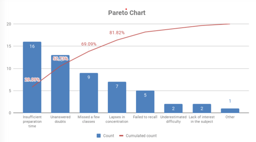
Using this data we plot our Pareto.

As can be seen, the top three reasons - Insufficient preparation time, Unanswered doubts, and Missed a few classes account for about 80% of the results.
Pareto is also called the 80/20 principle. Some examples include
- 80% of a company's output is produced by 20% of its workers.
- 80% of budget overruns are caused by 20% of expenses.
- 80% of the wealth is owned by 20% of the population.